Well, after a grand total of about a month straightish, my streak of posting daily comes to an end. Oh well!
I’ll certainly keep trying to update regularly, because as I’ve said, this is supposed to function as my golden record. It’s where I put my experiences, things that I enjoy, and things that I find worth sharing on the internet. (Rarer than you might think!)
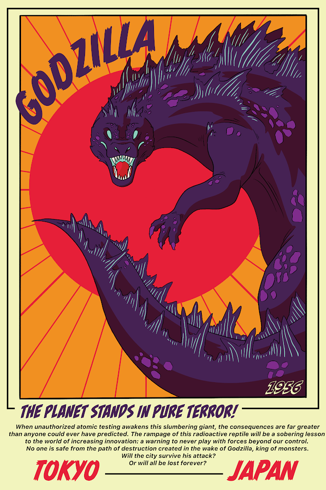
Anyway: my deep love-hate relationship with werewolf media has produced a fictional movie concept!
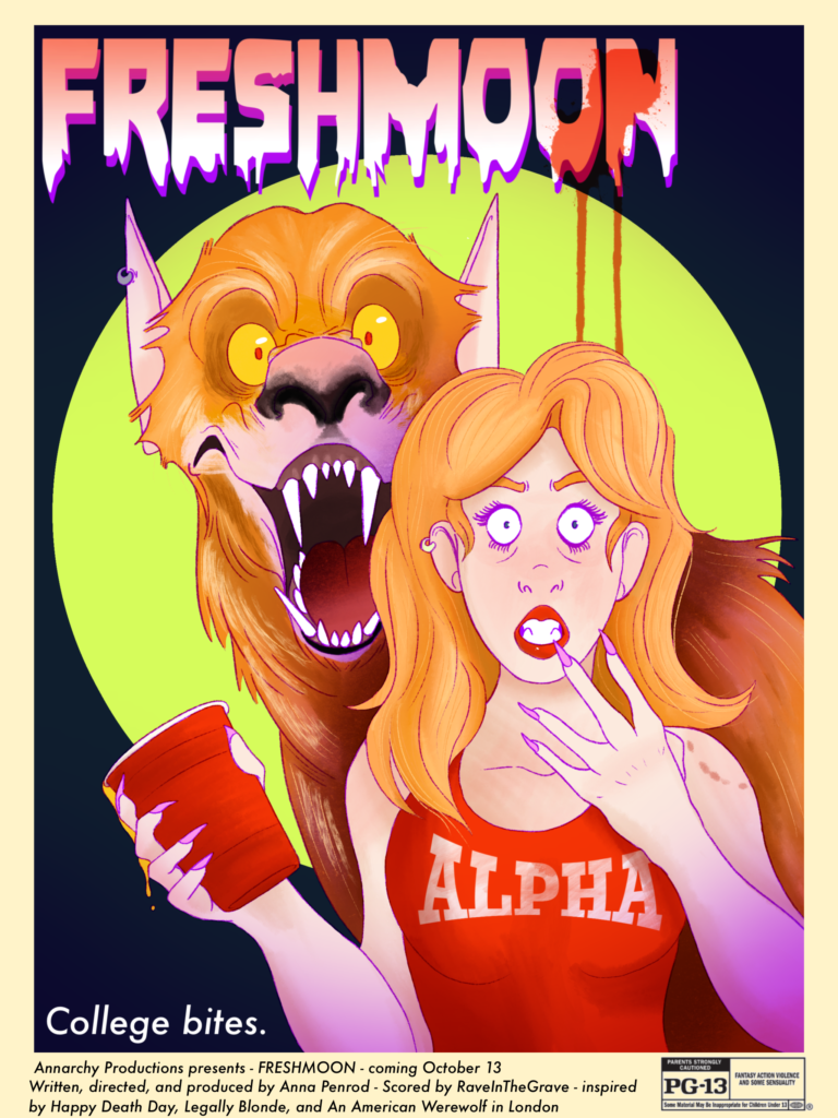
After blacking out at a frat party, popular sorority girl Jessica is stunned to learn that the creepy fraternity president was found in the bathroom, mauled to death. When she realizes she never had a drop of alcohol at the party, she begins to wonder if it has something to do with that strange dog bite she had gotten last week…
Terrible puns aside, the entire concept (as the poster says) is more or less the fantasy lovechild of Legally Blonde and An American Werewolf in London: ditzy blonde sorority girl who is smarter than she’s letting on, who is unwittingly murdering creepy frat dudes during their parties on the full moon.
I like the concept, but I genuinely had SO MUCH FUN with designing this poster. I’m no graphic designer, but I’ve got a good sense for balance and fun designs beyond the usual “‘head salad” that all movie posters have devolved into nowadays.
Let me show you:
BAD MOVIE POSTERS:
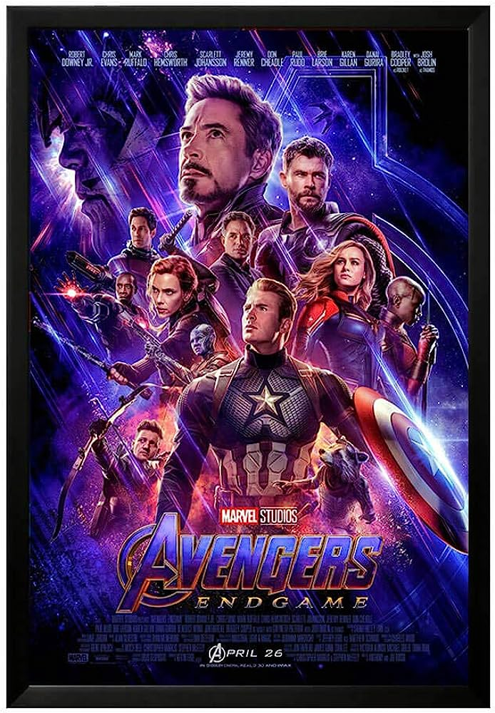
Head salad. Everyone is making the same expression, lives in the same color palette, and also everyone is confusingly sized throughout the poster. The blues, purples, and golds are a fun idea, but ultimately this poster is a mega-disappointment.
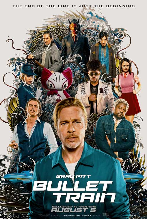
Head salad, bland “action movie” font, everyone’s color palette is once again blending into each other…bad. This is sad, because apparently this movie is really good. Does the poster convey that to me? No.
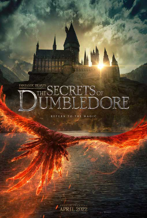
Bad! This looks like a youtube thumbnail. Return to the magic? What, the magic of slapping some images on top of each other and calling it a day?
Bad. Instead of letting you feel the vastness of mars and his truly helpless situation, you get stared dead in the face by the massive noggin of Matt Damon, as if he’s going to bite your nose or sneeze on you. It makes me very uncomfortable. Great movie! Bad poster.
Listen: I know I’m biased towards an illustrated movie poster, but there are just…better posters out there.
Speaking of…
REALLY GOOD MOVIE POSTERS:
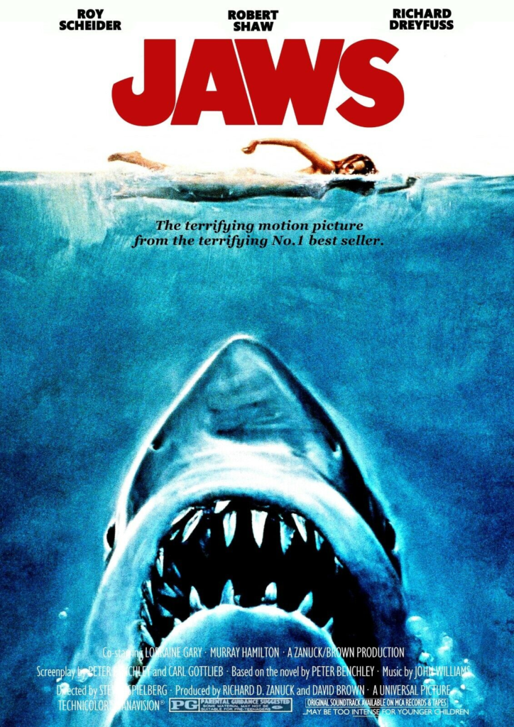
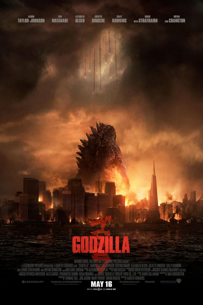
Obviously this one is a classic. (Shoutout to that PG rating! Seems wrong, given the naked woman on the poster, but hey. Different times.) Two solid contrasting colors, the entire theme of the movie on full display: BIG SHARK. EAT PEOPLE. Got it! The illustration and the bold font make this memorable because it’s so simple.
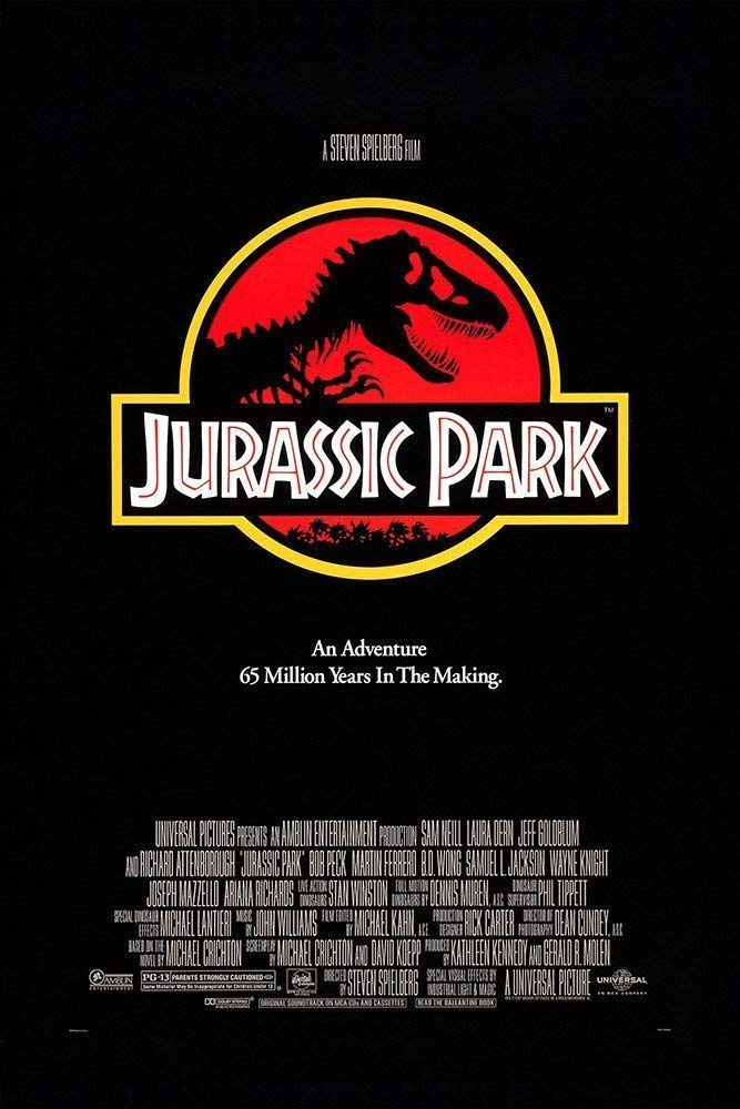
The logo, the tagline, the PURE GRAPHIC CLEANLINESS. Is this an ad for a movie, or an actual park I can visit?? So good. The colors pop and the whole thing just screams dinosaur movie. The adventure aesthetic oozes off of this thing.
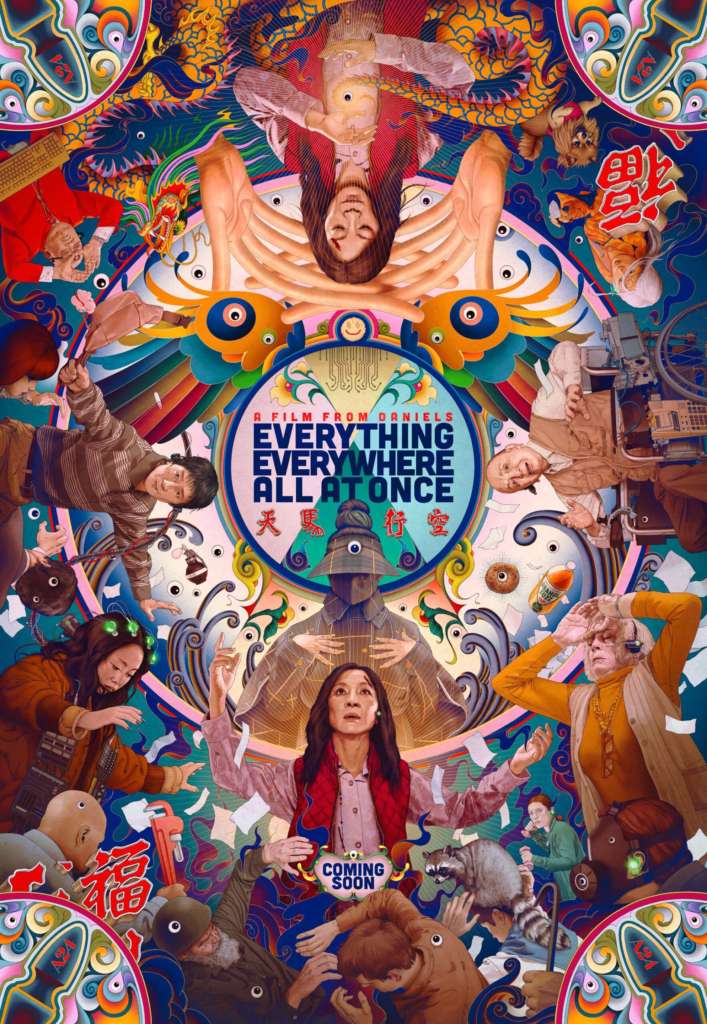
Everything about this poster screams to the sheer over-the-top-ness that is this movie, with this awesome illustrated style. The colors are flawless, the character pileup just works, all of it. This is what head salad posters think they are. None come close. This is a chaotic poster done right.
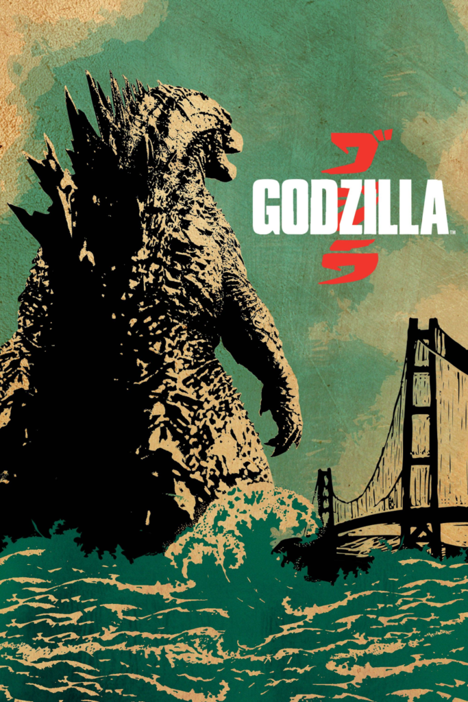
Need I say more? This was for the 2014 movie, and taking inspiration from its hand-printed movie poster past was a fabulous idea. You can practically see the layers of block print and screen print laid on top of each other, and it makes my brain so happy.
(To be fair, there were other posters released that did not do nearly as good of a job as as this one./)
However: this poster still goes unbelievably hard.
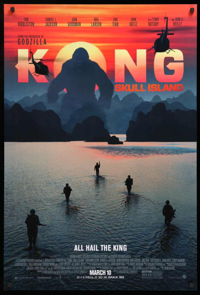
The use of colors! The silhouetting! The use of the sun as the O! This is how you take a live action movie poster and make me like it.
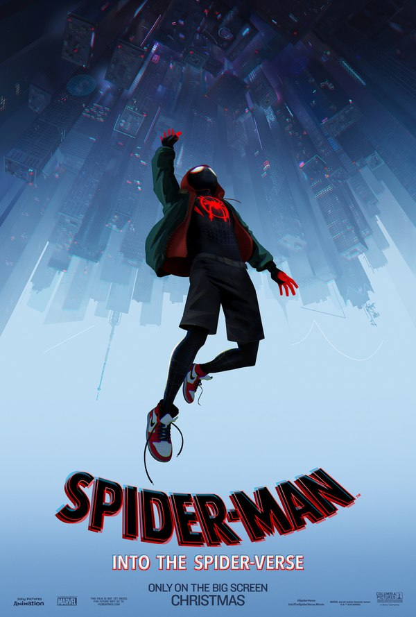
Leading lines galore, a color palette that makes sense, and the entire thesis of the story on one image. Absolutely fabulous. Sadly enough, “across the spiderverse” didn’t do this, and opted for a head salad. This one’s great though!
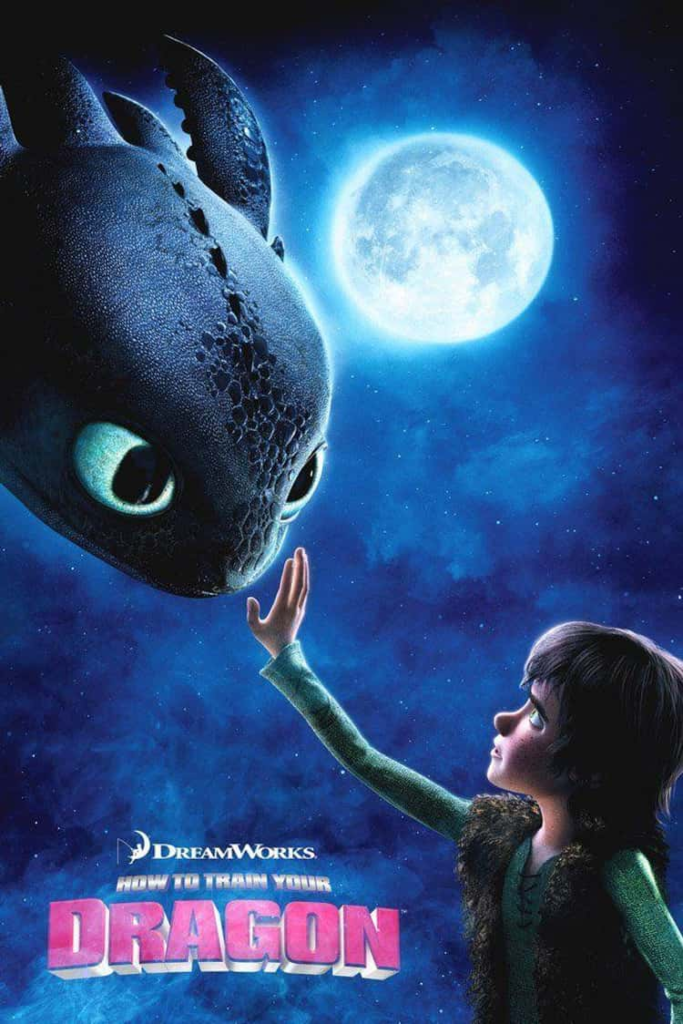
Again, the thesis of the movie in one image! It’s not my favorite, but it’s more proof that animated movies don’t have to resort to head salads either.
Lastly,
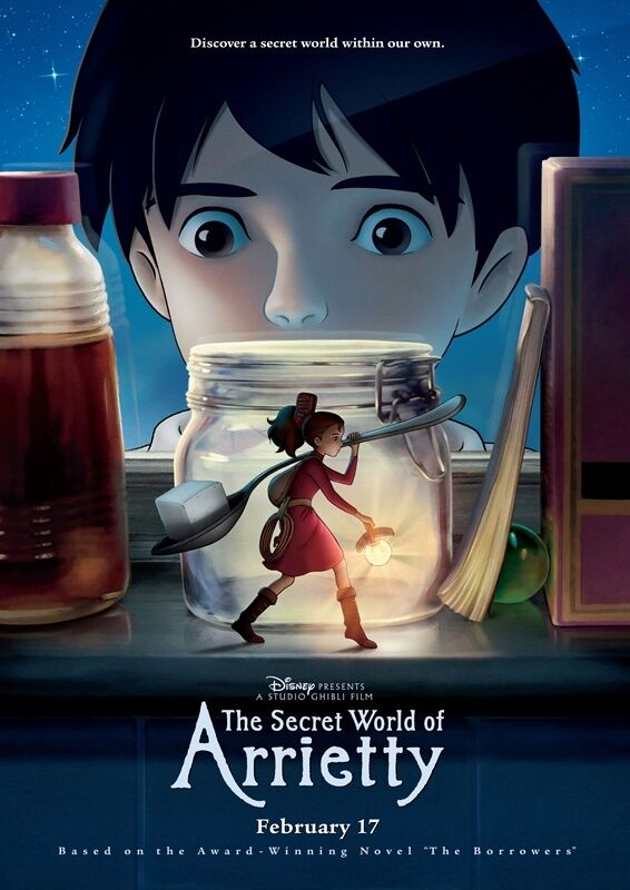
Another “here’s the story in the poster”! That I love. The lighting, the vibes, so good.
Anyway–this is all a long way of saying that sure, don’t just a book by its cover: a lot of the bad movie posters have objectively good movies behind them. But, if your movie poster is nothing more than a heavily-filtered photoshop character lineup, I will never forgive you.
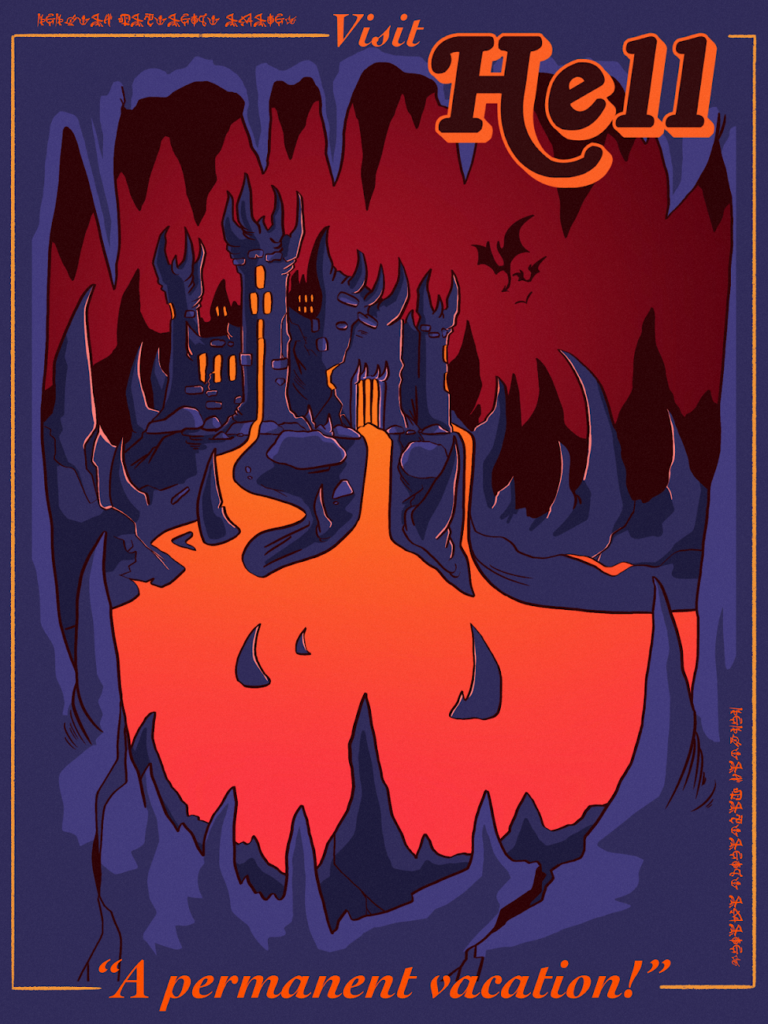
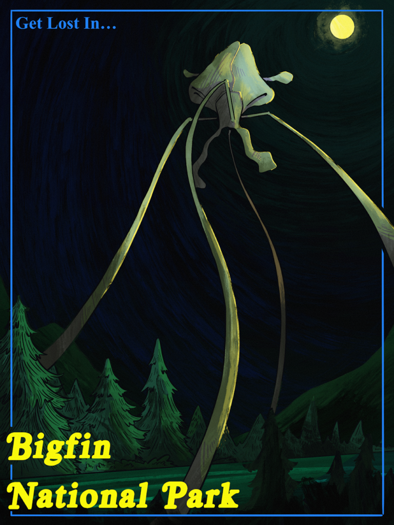
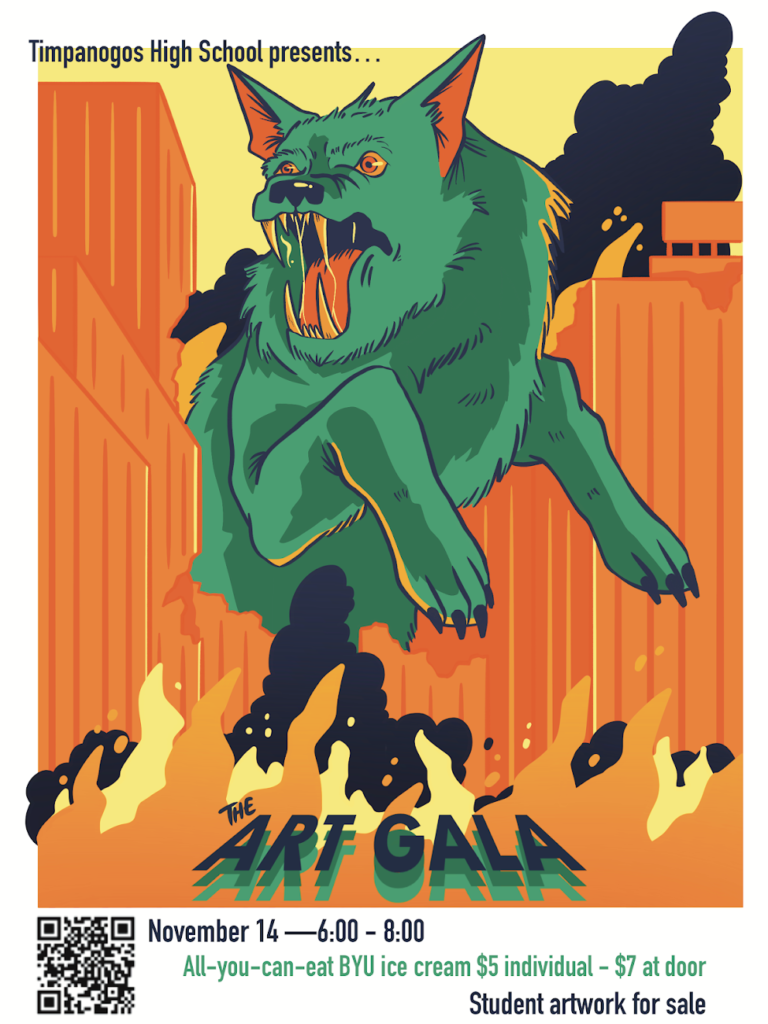
These aren’t all movie posters, but I think you can tell what my biases are based on the ones I make.
that is all!
November 21, 2023
Leave a Reply